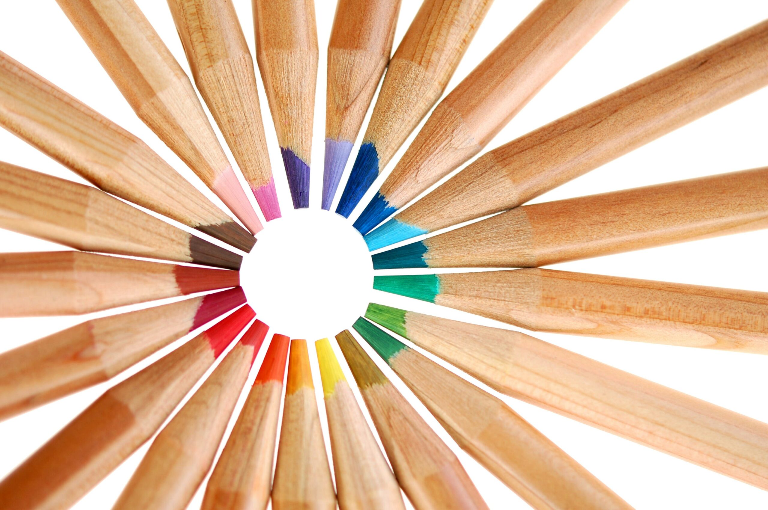
You’re standing in front of a vibrant canvas, a palette of pigments laid out before you. The possibilities are endless, and yet, where do you begin? For many, the answer lies in a fundamental tool that underpins every artistic discipline that uses color: the color wheel. It’s more than just a pretty circle; it’s a map, a guide, and a storyteller that unlocks the secrets of how colors interact, harmonize, and create emotion. Understanding the basics of the color wheel isn’t about memorizing scientific formulas; it’s about developing an intuitive language for color that will empower you in your creative endeavors, whether you’re painting, designing, decorating, or simply trying to choose the perfect outfit.
At the heart of every color wheel, you’ll find the primary colors. These are the building blocks, the foundational hues from which all other colors can theoretically be mixed. They are called “primary” because they cannot be created by mixing other colors together. Think of them as the original ingredients.
Red: The Color of Passion and Energy
Red is arguably the most emotionally charged color. It’s the color of fire, of blood, of love and anger. On the color wheel, it sits as a potent force, demanding attention and igniting a sense of urgency or excitement.
Red in Art and Design
You’ll see red used to draw the eye, to emphasize crucial elements, or to convey a feeling of warmth and passion. In graphic design, a strategically placed splash of red can make a logo pop. In interior design, a red accent wall can add vibrancy to a room. However, too much red can be overwhelming, so its use often requires careful consideration. Its raw energy can be both captivating and, if not managed well, a little too much to handle.
Yellow: The Hue of Sunshine and Joy
Yellow is the color of sunlight, of happiness, of optimism. It’s a cheerful and attention-grabbing color that can brighten any space or design. It’s inherently uplifting and often associated with childhood and playfulness.
Yellow’s Impact on Perception
Yellow has the ability to make spaces feel larger and more inviting. In marketing, it’s often used to convey affordability and approachability. Think of fast-food chains that utilize yellow extensively in their branding – it’s meant to evoke a sense of speed and positive association. However, be mindful of using overly bright or intense yellows, as they can sometimes induce feelings of anxiety or irritation, much like staring directly at the sun for too long. The spectrum of yellow is vast, from the pale, gentle warmth of buttercup to the sharp, electric intensity of lemon.
Blue: The Realm of Calm and Serenity
Blue is the color of the sky and the ocean, representing tranquility, stability, and depth. It’s a calming and dependable hue that can create a sense of peace and spaciousness.
Blue’s Psychological Effects
Blue is often used in corporate branding to convey trustworthiness and professionalism. In interior design, shades of blue can create a serene and relaxing atmosphere, making them popular choices for bedrooms and bathrooms. Different blues evoke different feelings: a light sky blue might feel airy and open, while a deep navy can feel sophisticated and grounding. It’s a color that allows the mind to rest, to wander, and to find a sense of stillness.
Understanding the color wheel is essential for anyone interested in art and design, as it provides a foundational framework for mixing colors and creating visually appealing compositions. For a deeper dive into the principles of color theory and how the color wheel functions, you can explore this informative article at Freaky Science. This resource offers insights into primary, secondary, and tertiary colors, as well as tips on how to effectively use the color wheel in your creative projects.
Secondary Colors: The First Combinations
Once you have your primary colors, you can begin to mix them to create the secondary colors. These are the next tier in the color wheel’s hierarchy, born from the direct combination of two primary colors.
Green: The Blend of Nature and Growth
Green is the result of mixing blue and yellow. It’s the color of nature, of growth, of renewal, and of balance. It’s a universally appealing color that evokes feelings of harmony and freshness.
The Significance of Green
Green is often used in environmental campaigns and brands that promote sustainability. In design, it can create a sense of calm and organic beauty. Its presence can bring the outdoors in, fostering a connection to the natural world. The subtle variations in green are endless, from the muted olive of a forest floor to the vibrant emerald of a lush jungle. It’s a color that signifies life and abundance.
Orange: The Warmth of Sunset and Enthusiasm
Orange is created by mixing red and yellow. It’s a warm, energetic, and inviting color that can evoke feelings of enthusiasm, creativity, and warmth. Think of autumn leaves or ripe citrus fruits.
Orange’s Dynamic Appeal
Orange is known for its ability to stimulate conversation and create a sense of sociability. In design, it can add a playful and energetic touch. It’s a color that’s both friendly and exciting, often used to convey fun and affordability. From the soft blush of a peach to the fiery intensity of a marigold, orange offers a spectrum of warmth and vibrancy. It’s a color that encourages connection and brings a sense of joyful anticipation.
Purple (Violet): The Mystique of Royalty and Creativity
Purple is the result of mixing red and blue. It’s a color often associated with royalty, luxury, spirituality, and creativity. It carries an air of mystery and intrigue.
Purple’s Evocative Power
Purple can be both calming and stimulating, depending on its shade. Lighter violets can feel delicate and romantic, while deeper purples can evoke a sense of opulence and sophistication. It’s a color that often inspires imagination and introspection. In art, it can add a touch of the ethereal or the dramatic. Its duality makes it a fascinating color to work with, capable of both soothing and exciting the senses.
Tertiary Colors: Expanding the Palette
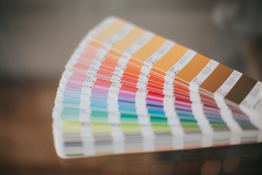
Moving beyond the secondary colors, you’ll encounter the tertiary colors. These are formed by mixing a primary color with an adjacent secondary color. This process further expands the spectrum and allows for more nuanced and complex color combinations.
Understanding the Mixing Process
Imagine your color wheel as a clock face. The tertiary colors lie in between the primary and secondary colors. For instance, you have red and orange as adjacent colors. Mixing red with orange creates red-orange. Similarly, mixing yellow with orange produces yellow-orange. This pattern continues around the entire wheel.
Red-Orange: A Fiery Blend
Red-orange is a vibrant and energetic hue that combines the passion of red with the warmth of orange. It’s a color that can be both bold and inviting, often associated with enthusiasm and excitement. Think of the intense hues of a sunset or the glow of embers.
Yellow-Orange: The Zest of Citrus
Yellow-orange is a bright and cheerful color that brings together the joy of yellow with the warmth of orange. It’s reminiscent of ripe fruits like peaches and apricots, and can evoke feelings of optimism and creativity.
Yellow-Green: The Lushness of Spring
Yellow-green is a lively and refreshing color that combines the freshness of yellow with the natural feel of green. It’s the color of new leaves in spring, and can evoke feelings of growth and vitality.
Blue-Green (Teal): The Depths of the Ocean
Blue-green, often called teal, is a sophisticated and calming color that blends the serenity of blue with the natural feel of green. It’s reminiscent of deep ocean waters and can create a sense of tranquility and depth.
Blue-Violet: The Mystery of Twilight
Blue-violet, or indigo, is a rich and evocative color that merges the depth of blue with the mystique of purple. It’s often associated with creativity, intuition, and a sense of the sublime, like the colors of twilight.
Red-Violet: The Intensity of Amethyst
Red-violet, or magenta, is a powerful and passionate color that combines the intensity of red with the sophistication of purple. It can be both dramatic and elegant, evoking a sense of luxury and creativity.
Color Harmonies: Creating Visually Pleasing Palettes
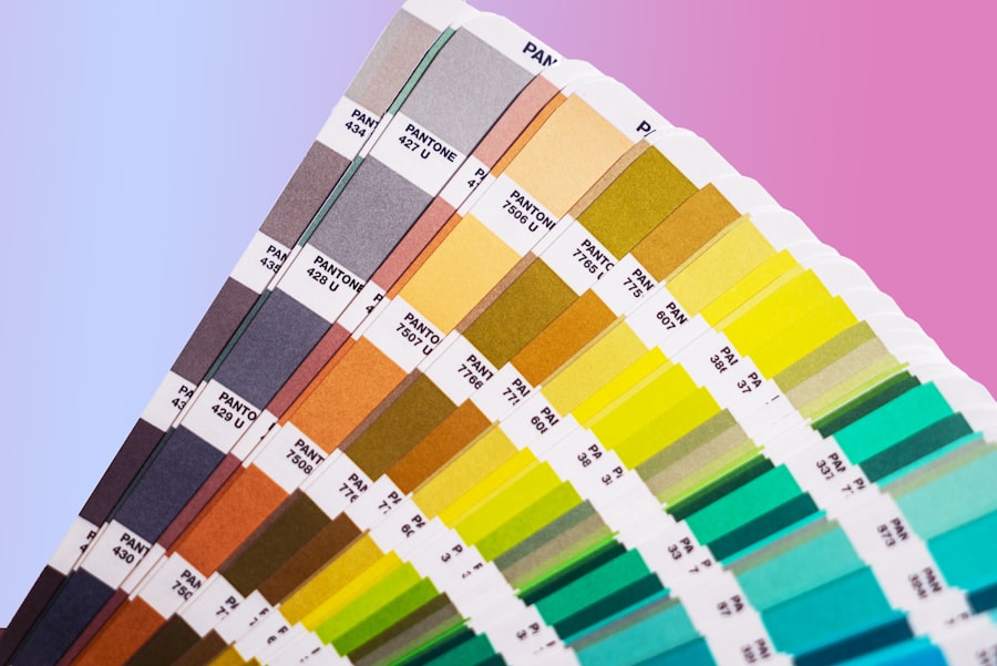
Now that you understand how colors are related on the wheel, you can begin to explore how to combine them in aesthetically pleasing ways. These combinations are known as color harmonies, and they provide a framework for creating balanced and impactful palettes.
Complementary Colors: High Contrast and Vibrancy
Complementary colors are those that sit directly opposite each other on the color wheel. When placed next to each other, they create the strongest contrast and the most vibrancy. Think of red and green, blue and orange, or yellow and purple.
The Power of Contrast
The high contrast between complementary colors can make them appear to vibrate or intensify each other. This is why they are often used in design to grab attention and create a sense of excitement. However, using them in equal amounts can be overwhelming, so they are often used in unequal proportions, with one color dominating and the other acting as an accent.
Applications of Complementary Colors
In art, painters might use complementary colors to create a sense of drama or to make certain elements stand out. In graphic design, a complementary color scheme can be highly effective for calls to action or for creating visually arresting graphics. Even in fashion, a pop of a complementary color can elevate an outfit.
Analogous Colors: Harmony and Flow
Analogous colors are those that are next to each other on the color wheel. They typically consist of one primary color and two secondary colors, or vice versa. For example, yellow, yellow-green, and green. These color schemes tend to be very harmonious and pleasing to the eye.
Creating a Sense of Unity
Because analogous colors share common undertones, they create a sense of unity and flow. They are often used to create a calm and cohesive atmosphere. Think of the warm hues of a sunset or the cool tones of a forest.
Practical Uses of Analogous Palettes
In interior design, analogous color schemes are excellent for creating a serene and inviting environment. In branding, they can convey a sense of stability and reliability. They are also a safe and effective choice for beginners who are looking to create a visually appealing palette without the risk of clashing colors.
Triadic Colors: Bold and Balanced
A triadic color scheme uses three colors that are equally spaced around the color wheel. This creates a vibrant and well-balanced palette. The classic example is red, yellow, and blue.
The Importance of Balance
While triadic schemes can be very dynamic, they also offer a sense of balance because the colors are evenly distributed. This means you can use them with confidence, knowing they are inherently harmonious.
Tips for Using Triadic Color Schemes
When working with a triadic color scheme, it’s often best to let one color be dominant and use the other two as accents. This prevents the palette from becoming too overwhelming. The contrast between the three colors can create a lively and engaging visual experience.
Understanding how the color wheel works can greatly enhance your artistic endeavors and design projects. The color wheel serves as a fundamental tool for mixing colors and creating harmonious palettes. For a deeper dive into the science behind colors and their interactions, you might find this article on color theory particularly insightful. It explains the principles of color mixing and the emotional impact of different hues. You can read more about it in this related article.
Beyond the Basics: Understanding Color Temperature and Value
| Color | Primary Colors | Secondary Colors | Tertiary Colors |
|---|---|---|---|
| Red | Red | N/A | Red-Orange, Red-Violet |
| Yellow | Yellow | N/A | Yellow-Orange, Yellow-Green |
| Blue | Blue | N/A | Blue-Green, Blue-Violet |
While the color wheel provides the fundamental relationships between hues, understanding color temperature and value will further refine your ability to use color effectively. These concepts add depth and dimension to your understanding.
Color Temperature: Warmth and Coolness
Color temperature refers to the perceived warmth or coolness of a color. Warm colors, like reds, oranges, and yellows, tend to advance and feel energetic. Cool colors, like blues, greens, and violets, tend to recede and feel calming.
The Psychology of Temperature
Warm colors are associated with feelings of energy, passion, and excitement. They can make a space feel cozier and more intimate. Cool colors, on the other hand, are associated with feelings of calmness, tranquility, and sophistication. They can make a space feel larger and more open.
Manipulating Perceived Space
By strategically using warm and cool colors, you can influence the perception of space. For example, painting a room with warm colors can make it feel smaller and more intimate, while using cool colors can make it feel more expansive. This is a powerful tool for interior designers and artists alike.
Color Value: Lightness and Darkness
Color value refers to the lightness or darkness of a color. This is often described as the tint (adding white to lighten a color), shade (adding black to darken a color), or tone (adding gray to desaturate a color).
The Impact of Value on Mood
Value plays a crucial role in mood and contrast. High contrast, achieved by pairing very light and very dark values, can create a dramatic and energetic effect. Low contrast, using values that are close together, can create a more subtle and calming effect.
Creating Depth and Dimension
Understanding value is essential for creating depth and dimension in your work. By varying the values of your colors, you can create the illusion of light and shadow, making your creations more lifelike and engaging. This is fundamental to rendering form and volume, whether you’re working with paint, pencils, or digital tools.
The color wheel, in its elegant simplicity, is a gateway to a world of creative possibilities. By grasping these fundamental principles – the primaries, secondaries, and tertiaries, the harmonious relationships between colors, and the nuances of temperature and value – you equip yourself with the tools to not just see color, but to understand it, to wield it, and to make it sing. So, as you pick up your brush, your pen, or your design software, remember the map that the color wheel provides. It’s your guide on a journey of visual exploration, promising to enrich your creations and deepen your connection with the vibrant world around you.

Why Your Brain Had to Invent Magenta
FAQs
What is the color wheel?
The color wheel is a circular chart that organizes colors in a way that shows their relationships to each other. It is used to understand color theory and how different colors interact with each other.
How does the color wheel work?
The color wheel works by organizing colors into primary, secondary, and tertiary categories. Primary colors (red, blue, and yellow) are the basis for all other colors. Secondary colors (orange, green, and purple) are created by mixing two primary colors. Tertiary colors are created by mixing a primary color with a secondary color.
What are complementary colors on the color wheel?
Complementary colors are pairs of colors that are directly opposite each other on the color wheel. When placed next to each other, they create a strong contrast and enhance each other. Examples of complementary colors are red and green, blue and orange, and yellow and purple.
How is the color wheel used in design?
Designers use the color wheel to create color schemes that are visually appealing and harmonious. They can use complementary colors for high contrast, analogous colors for a harmonious look, or triadic colors for a balanced feel. Understanding the color wheel helps designers create effective color combinations.
What is the significance of the color wheel in art and fashion?
In art and fashion, the color wheel is used to create visually pleasing compositions and color palettes. Artists and fashion designers use the color wheel to understand color relationships, create mood and atmosphere, and evoke certain emotions through their work.