You’ve likely marveled at a rainbow, its vibrant arc a testament to the orderly progression of colors from red to violet. This is your familiar world of spectral colors, those hues produced by single wavelengths of light. But what if you’ve ever seen a color that doesn’t quite fit that neat spectrum? A color that evokes a sensation beyond a simple wavelength? You’ve encountered nonspectral colors. They’re the silent majority, the nuanced shades that paint the richer, more complex tapestry of your visual experience, and understanding them unlocks a deeper appreciation for how you perceive the world.
When you look at a rainbow, you’re witnessing the visible spectrum, a continuous band of electromagnetic radiation that your eyes can detect. Each color you see, from the fiery red to the deep violet, corresponds to a specific wavelength of light. Red, for instance, sits at the longer end of the visible spectrum, around 700 nanometers, while violet is at the shorter end, about 400 nanometers. The colors in between – orange, yellow, green, blue, indigo – are also tied to these distinct wavelengths. This is the realm of spectral colors, the building blocks that physics can neatly explain.
What are Spectral Colors?
Spectral colors are, by definition, those that can be produced by a single wavelength of light. Think of the light from a monochromatic laser; it emits light at one precise wavelength, and the color you perceive is a pure spectral color. The rainbow, formed when sunlight is dispersed by raindrops, is a perfect demonstration of this. Each droplet acts like a prism, splitting white light into its constituent wavelengths, and you see these wavelengths as distinct colors.
The Limits of the Spectrum
While the spectrum provides a foundational understanding of color, it’s not the whole story. Your visual system is far more sophisticated than simply registering individual wavelengths. It actively interprets and constructs color based on a complex interplay of sensory input and neural processing. This is where nonspectral colors emerge, defying the neat categorization of the rainbow. You perceive them, yet they cannot be produced by a single wavelength of light. They are, in essence, creations of your brain, born from the way your eyes and mind work together.
Nonspectral colors are fascinating hues that cannot be found in the visible spectrum of light, as they are created by the combination of different wavelengths rather than existing as individual wavelengths themselves. For a deeper understanding of this concept, you might find the article on color perception and its implications in science particularly enlightening. You can read more about it in this related article: Freaky Science.
The Mystical Realm of Nonspectral Colors
Nonspectral colors are the visual rebels, the hues that don’t have a direct, one-to-one correspondence with a single wavelength of light. They are the result of a more intricate process, a dance between the light that enters your eyes and the sophisticated machinery of your visual system. You might not think of them consciously, but they are the colors that make your world truly vibrant and nuanced.
What Defines a Nonspectral Color?
The key to understanding nonspectral colors lies in how your eyes detect light. You have three types of cone cells in your retinas, each sensitive to different ranges of wavelengths: red-sensitive (L-cones), green-sensitive (M-cones), and blue-sensitive (S-cones). When light hits your retina, it stimulates these cones to varying degrees. Your brain then interprets these combined signals to perceive a color.
- The Trichromatic Theory: This theory, proposed by Thomas Young and later refined by Hermann von Helmholtz, explains how you perceive color based on the relative stimulation of these three cone types. For example, a pure spectral yellow stimulates both your L-cones and M-cones strongly, but your S-cones very little. Your brain interprets this specific combination of stimulation as yellow.
- The Complexity of Perception: However, this is where the simplicity of spectral colors breaks down. Many colors you see aren’t produced by a single wavelength that exclusively targets one or two cone types in a way that a spectral color would. Instead, they are the result of specific combinations of stimulation across all three cone types, where no single wavelength can replicate that exact pattern.
Examples of Nonspectral Hues
The most common examples of nonspectral colors are magenta, brown, and gray. You’ve seen them countless times, but have you ever stopped to consider why they’re different?
- Magenta: This is perhaps the quintessential nonspectral color. You never see a spectral line for magenta in a rainbow. Magenta is perceived when your eyes receive a combination of red and blue light, but without any green light. Imagine shining a red laser and a blue laser at the same spot on a white surface. The resulting color you perceive is magenta. No single wavelength of light can produce this sensation. It’s a color your brain “invents” to represent the absence of green light when both red and blue are present.
- Browns: Browns are fascinatingly complex nonspectral colors. They are essentially dark shades of orange, red, or yellow. You perceive brown when light of certain wavelengths is present but at a reduced intensity, or when there’s a mixture of wavelengths that, when desaturated, appear brown. For instance, a muted orange can appear brown. You can’t isolate a single wavelength that reliably produces “brown.” Instead, it’s a result of how your brain interprets a mix of wavelengths and their intensity.
- Grays: Grays are achromatic colors, meaning they lack hue. You perceive gray when all three cone types are stimulated equally, but at a reduced intensity. Pure white is when all three are stimulated equally at high intensity, and black is the absence of light. Grays lie in between, representing varying degrees of overall light stimulation without a preference for any particular color.
The Brain’s Color Chemistry: How We See What Isn’t There
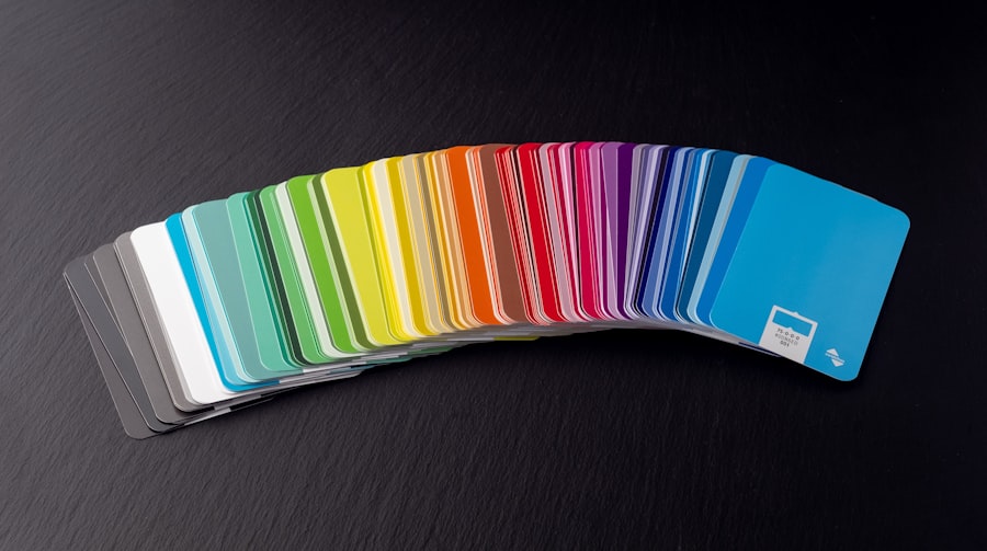
Your brain is the ultimate artist, the conductor of your visual symphony. While the eyes are the instruments, it’s the brain that interprets the notes and creates the music of color. This is particularly evident in the generation of nonspectral colors, where your neural pathways go beyond simply reporting what the light is doing.
Opponent Process Theory: A Deeper Dive
While the trichromatic theory explains the initial sensing of light by cone cells, the opponent process theory, developed by Ewald Hering, offers a more complete picture of color perception. This theory suggests that color vision is based on three opposing pairs of colors: red-yellow, green-blue, and black-white.
- Neural Antagonism: Your visual system is thought to have neural pathways that operate in an “on-off” or “excitatory-inhibitory” manner. For example, one type of neuron might be excited by red light and inhibited by green light. Another might be excited by blue and inhibited by yellow. The third pair handles luminance (black-white).
- Explaining Afterimages: The opponent process theory beautifully explains phenomena like color afterimages. If you stare at a red object for a while and then look at a white surface, you’ll see a green afterimage. This occurs because your red-sensitive neurons become fatigued, and when you shift your gaze, the opposing green-sensitive neurons become more dominant, creating the perception of green.
- Nonspectral Colors and Opponent Processes: This theory is crucial for understanding nonspectral colors. Magenta, for instance, is explained by opponent processes. It’s not a color that can be represented by a single channel in the red-green or blue-yellow systems. Instead, it arises from a specific combination of signals within these systems, often involving simultaneous activation of red and blue channels without corresponding green activation, and vice-versa for its opponent.
Color Constancy and Context
Your brain doesn’t just process isolated colors; it also considers the context in which you see them. This phenomenon, known as color constancy, allows you to perceive the color of an object as relatively stable, even under varying lighting conditions.
- Adapting to Illumination: Imagine you’re looking at a red apple. In bright sunlight, the light hitting your retina will have a different spectral distribution than when you’re looking at the same apple in dim, artificial light. Yet, you still perceive it as red. Your brain is constantly making adjustments, compensating for the color of the illuminant, to maintain a consistent perception of the apple’s true color.
- The Influence of Surroundings: The colors around an object also influence your perception of its hue. This is why a gray square can appear bluish when placed on a yellowish background, and yellowish when placed on a bluish background. Your brain is using relative information to interpret the color. This constant recalibration and contextual analysis are integral to how you perceive the full spectrum of colors, including those that don’t have spectral counterparts.
The Art of Mixing: Creating Nonspectral Colors

The creation of nonspectral colors is a fundamental principle in fields ranging from art to digital display technology. By understanding how light and pigment interact, you can intentionally generate these seemingly elusive hues.
Additive Color Mixing: Light and Screens
Additive color mixing describes how colors are created by adding together different wavelengths of light. This is how your computer screen, television, and smartphone display work.
- Primary Colors of Light: The primary colors in additive mixing are red, green, and blue (RGB). By combining these three colors of light in varying proportions, you can create almost any color visible to the human eye.
- Creating Magenta: Magenta is a prime example of an additive nonspectral color. It’s formed by mixing red light and blue light. Notice that green light is absent. This combination, as we’ve discussed, stimulates your L and S cones strongly while leaving your M cones relatively unstimulated, leading to your brain’s perception of magenta.
- Yellow, Cyan, and White: Mixing red and green light produces yellow. Mixing green and blue light produces cyan. And mixing all three primary colors of light (red, green, and blue) at full intensity results in white light. These combinations, particularly yellow and cyan, are also nonspectral in their combined form, though they might be close to spectral wavelengths.
Subtractive Color Mixing: Pigments and Paint
Subtractive color mixing, on the other hand, involves pigments and inks. Instead of adding light, you’re absorbing (subtracting) certain wavelengths from white light.
- Primary Colors of Pigment: The primary colors in subtractive mixing are typically cyan, magenta, and yellow (CMY). When you mix these pigments, they absorb specific wavelengths from the light reflecting off a surface.
- Creating Secondary Colors: Mixing cyan and yellow pigments produces green, as the cyan absorbs red light and the yellow absorbs blue light, leaving only green light to be reflected. Mixing yellow and magenta produces red, as yellow absorbs blue and magenta absorbs green, leaving red. Mixing magenta and cyan produces blue, as magenta absorbs green and cyan absorbs red, leaving blue.
- The Absence of Black (Initially): Theoretically, mixing all three subtractive primaries should produce black by absorbing all wavelengths. However, in practice, due to the impurities in pigments, mixing CMY often results in a muddy brown or dark gray. This is why black (K, for Key) is often included in printing (CMYK) to achieve true blacks and deeper tones.
- Nonspectral Hues in Pigment: Many of the colors you perceive when working with pigments are nonspectral. The complex interactions of absorption and reflection create shades that don’t correspond to single wavelengths. The nuanced browns, desaturated greens, and muted purples you can create with paints are all examples of nonspectral colors born from subtractive mixing.
Nonspectral colors, which are hues not found in the visible spectrum of light, can be fascinating to explore as they challenge our understanding of color perception. For those interested in delving deeper into the science of color and its various manifestations, a related article can provide valuable insights. You can read more about this intriguing topic in the article found here, where the complexities of color theory are discussed in detail. Understanding nonspectral colors not only enhances our appreciation of art and design but also enriches our grasp of visual experiences in everyday life.
The Significance of Nonspectral Colors in Your World
| Color Name | Definition |
|---|---|
| Red | A primary color that is not part of the visible spectrum of light |
| Green | A primary color that is not part of the visible spectrum of light |
| Blue | A primary color that is not part of the visible spectrum of light |
| Yellow | A secondary color that is not part of the visible spectrum of light |
| Cyan | A secondary color that is not part of the visible spectrum of light |
| Magenta | A secondary color that is not part of the visible spectrum of light |
The existence and perception of nonspectral colors are not merely academic curiosities; they have profound implications for your daily life, influencing everything from how you appreciate art to how you interact with technology.
Art and Design: Expanding the Palette
For artists and designers, understanding nonspectral colors is essential for creating impactful and evocative works.
- Emotional Resonance: Nonspectral colors often carry a rich emotional weight that pure spectral colors might not. A deep, desaturated magenta can evoke feelings of luxury or mystery, while a warm, earthy brown speaks of stability and nature. Artists leverage these nuances to communicate complex ideas and emotions.
- Creating Depth and Realism: The subtle variations and shades that nonspectral colors provide are crucial for achieving realism in paintings and digital art. The ability to render the soft blush on a cheek, the weathered texture of wood, or the atmospheric haze of a distant landscape relies heavily on the skillful use of nonspectral hues.
- Beyond the Spectrum: When artists mix pigments, they are inherently working with subtractive color theory. They are not limited to the pure spectral colors found in a rainbow. Instead, they can blend, desaturate, and darken colors to create an infinitely richer palette, going far beyond what a simple prism can reveal.
Technology and Displays: Bridging the Gap
The technology you use daily to consume information and entertainment is built upon the principles of color mixing, including the generation of nonspectral colors.
- Screen Calibration: The colors you see on your computer monitor or smartphone screen are the result of additive RGB color mixing. The designers of these displays aim to reproduce a wide range of colors, including nonspectral hues like magenta, to create visually compelling and accurate images. Achieving accurate color reproduction often involves calibrating these devices to ensure they display colors as intended.
- Printing and Photography: In printing and digital photography, the CMYK subtractive color model is used. The ability to reproduce vibrant colors, subtle skin tones, and deep shadows relies on the precise manipulation of cyan, magenta, and yellow inks or pixels. Without the understanding and generation of nonspectral colors, printed images would appear flat and uninteresting.
- Virtual and Augmented Reality: As virtual and augmented reality technologies advance, the accurate and immersive reproduction of color becomes even more critical. The creation of believable digital environments and experiences depends on the ability to generate a vast spectrum of colors, including those that lie outside the traditional spectral range.
Everyday Perception: A Richer Reality
Ultimately, the existence of nonspectral colors enriches your everyday visual experience. They are the colors that add subtlety, complexity, and depth to the world around you.
- Nuanced Observations: When you notice the subtle shift in the color of the sky as the sun sets, or the complex interplay of colors in a bouquet of flowers, you are observing the interplay of spectral and nonspectral hues. The world is rarely composed of pure, single-wavelength colors.
- Beyond the Basic: You appreciate the difference between a vibrant red and a muted, dusty rose. You understand the difference between a brilliant blue and a soft, grayish blue. These distinctions are made possible by your brain’s ability to interpret and generate a spectrum of colors that extends far beyond the simple arc of a rainbow.
You are a sophisticated color perceiver. While the rainbow offers a beautiful glimpse into the physics of light, your visual system is capable of so much more. By understanding nonspectral colors – the magentas, browns, and grays that don’t have a single spectral origin – you gain a profound appreciation for the active, interpretative nature of your own perception. The world you see is not just a reflection of wavelengths; it’s a vibrant masterpiece painted by the intricate collaboration of light, your eyes, and the incredible power of your brain.

Why Your Brain Had to Invent Magenta
FAQs
What are nonspectral colors?
Nonspectral colors are colors that cannot be created by a single wavelength of light. They are typically created by mixing different wavelengths of light together.
How are nonspectral colors different from spectral colors?
Spectral colors are the colors of the visible spectrum, which can be created by a single wavelength of light. Nonspectral colors, on the other hand, are created by mixing different wavelengths of light together.
What are some examples of nonspectral colors?
Some examples of nonspectral colors include pink, brown, and magenta. These colors cannot be created by a single wavelength of light, and are instead created by mixing different wavelengths together.
How are nonspectral colors perceived by the human eye?
Nonspectral colors are perceived by the human eye through a process called color mixing. When different wavelengths of light are mixed together, the brain perceives the resulting color as a nonspectral color.
What is the significance of nonspectral colors?
Nonspectral colors are important in art, design, and color theory. Understanding how nonspectral colors are created and perceived can help artists and designers create a wider range of colors and achieve specific visual effects.