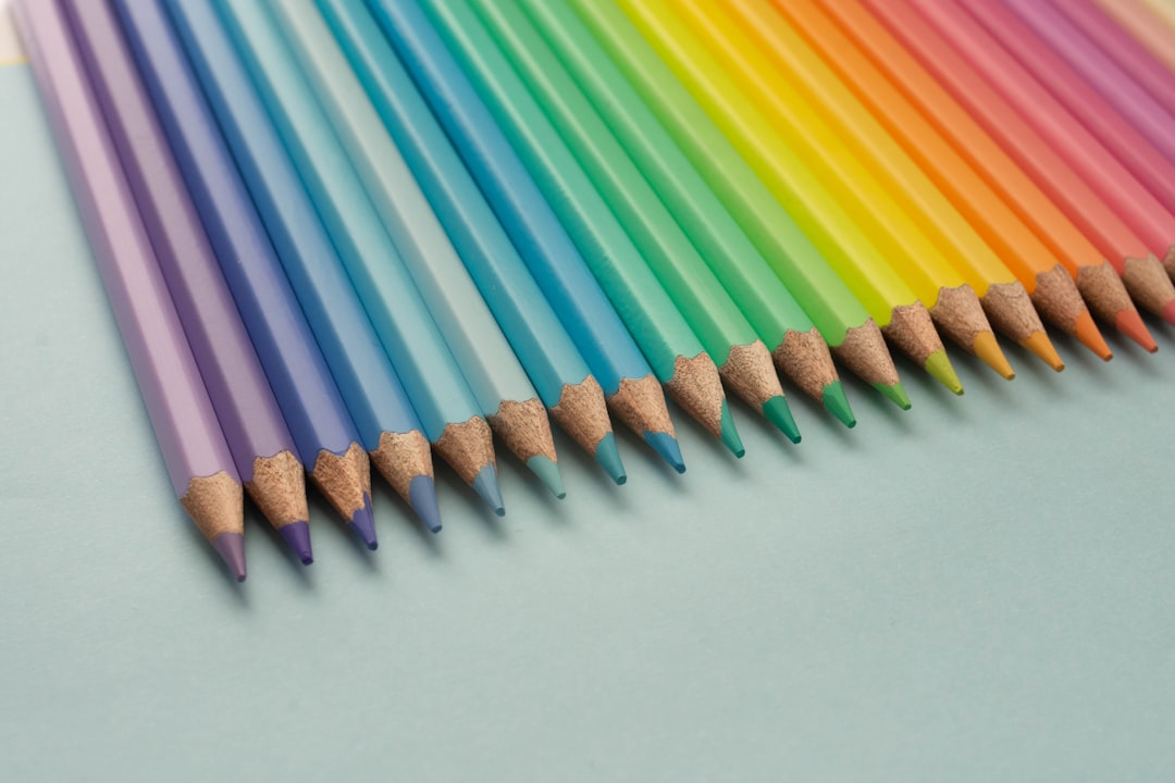
Color is more than just a visual experience; it profoundly influences your emotions and behaviors. Each hue carries its own psychological weight, evoking specific feelings and reactions. For instance, when you see the color red, it may ignite feelings of passion or urgency, while blue often instills a sense of calm and tranquility.
This psychological connection to color is not merely anecdotal; studies have shown that colors can affect your mood, decision-making, and even physiological responses. When you think about it, the colors surrounding you can shape your daily experiences in subtle yet significant ways. Moreover, the impact of color extends beyond mere emotional responses.
It can also influence your behavior in various contexts. For example, in a retail environment, warm colors like orange and yellow can create a sense of excitement and encourage impulse buying. Conversely, cooler colors may promote a more relaxed shopping experience, leading to longer browsing times.
Understanding these psychological effects can empower you to make more informed choices about the colors you surround yourself with, whether in your home, workplace, or wardrobe.
Key Takeaways
- Different colors can evoke different emotions and behaviors in individuals.
- Cultural influences play a significant role in how colors are interpreted and valued in different societies.
- Understanding the science of color matching can help in choosing the right shades for home decor or wardrobe.
- Companies use color to convey their message and attract customers in branding.
- Color trends evolve over time, reflecting the popular hues of different decades and generations.
Cultural Influences on Color Preferences: Exploring How Different Societies Interpret and Value Colors
Color preferences are not universal; they are deeply rooted in cultural contexts that shape how you perceive and value different hues. In some cultures, white symbolizes purity and new beginnings, often associated with weddings and celebrations. In contrast, in other societies, white may be linked to mourning and loss.
This divergence highlights how cultural narratives can influence your emotional connections to specific colors. When you travel or interact with diverse communities, you may find that your understanding of color expands, revealing new meanings and associations. Additionally, cultural influences extend to the use of color in art, fashion, and design.
For instance, in many African cultures, vibrant colors are celebrated as expressions of identity and heritage. In contrast, Scandinavian design often favors muted tones that reflect simplicity and minimalism. These cultural interpretations can guide your choices in personal style and home decor, allowing you to embrace colors that resonate with your own background or aspirations.
By exploring the cultural significance of colors, you can enrich your understanding of their role in your life.
The Science of Color Matching: How to Find the Right Shade for Your Home Decor or Wardrobe

Finding the perfect color for your home decor or wardrobe can feel like a daunting task, but understanding the science behind color matching can simplify the process. One essential principle is the color wheel, which illustrates how colors relate to one another. Complementary colors—those opposite each other on the wheel—create striking contrasts that can energize a space or outfit.
On the other hand, analogous colors—those next to each other—tend to create harmony and cohesion. By familiarizing yourself with these concepts, you can make more intentional choices that reflect your personal style. Another critical aspect of color matching is considering undertones.
Every color has underlying tones that can affect how it appears in different lighting conditions. For example, a seemingly neutral gray may have warm or cool undertones that can clash with other colors in your palette. To ensure a cohesive look, take the time to test paint samples or fabric swatches in various lighting conditions before making a final decision.
This attention to detail will help you create a space or wardrobe that feels balanced and true to your vision.
The Role of Color in Branding: How Companies Use Color to Convey Their Message and Attract Customers
| Company | Color | Message | Effect |
|---|---|---|---|
| McDonald’s | Yellow and Red | Friendly, energetic, and affordable | Attracts attention and stimulates appetite |
| Starbucks | Green | Relaxing, natural, and sustainable | Creates a calming and welcoming atmosphere |
| IBM | Blue | Trustworthy, professional, and secure | Instills confidence and reliability |
| Coca-Cola | Red | Exciting, passionate, and youthful | Stimulates appetite and creates a sense of urgency |
In the world of branding, color plays a pivotal role in shaping perceptions and attracting customers. Companies carefully select their brand colors to evoke specific emotions and convey their core values. For instance, green is often associated with health and sustainability, making it a popular choice for eco-friendly brands.
Meanwhile, blue is frequently used by tech companies to instill trust and reliability. When you encounter a brand’s color palette, it’s not just an aesthetic choice; it’s a strategic decision designed to resonate with your emotions and influence your purchasing behavior. Moreover, consistency in color usage across various platforms reinforces brand identity.
When you see a familiar color associated with a brand—whether on social media, packaging, or advertisements—it creates a sense of recognition and loyalty. This psychological connection can significantly impact your perception of the brand’s credibility and quality. As you navigate the marketplace, consider how color influences your choices and how brands leverage this powerful tool to connect with consumers like you.
The Evolution of Color Trends: Tracking the Popular Hues of Different Decades and Generations
Color trends are ever-evolving, reflecting societal changes and cultural movements throughout history. Each decade brings its own palette of popular hues that resonate with the zeitgeist of the time. For example, the bold colors of the 1980s—think neon pinks and electric blues—mirrored the era’s exuberance and rebellion against traditional norms.
In contrast, the muted tones of the 2000s signified a shift towards minimalism and understated elegance. As you observe these trends, you may find that they not only influence design choices but also reflect broader societal values and attitudes. Understanding the evolution of color trends can also inspire your personal style choices.
By exploring past palettes, you might discover hues that resonate with you on a deeper level or evoke nostalgia for certain periods in your life. Whether you’re redecorating your home or refreshing your wardrobe, consider incorporating elements from different eras to create a unique blend that reflects both current trends and timeless aesthetics.
The Debate Over “Dream” Colors: Exploring the Subjectivity of Color Preference and Its Implications
The concept of “dream” colors—those hues that individuals feel an innate connection to—sparks an intriguing debate about subjectivity in color preference. What one person considers a calming shade may be overwhelming to another. This subjectivity highlights how personal experiences, cultural backgrounds, and even psychological factors shape your relationship with color.
This debate also has implications for design choices in various contexts. For instance, when creating a space meant for relaxation—like a bedroom—you might gravitate towards soft blues or greens that evoke tranquility.
However, if those colors don’t resonate with you personally, they may not achieve the desired effect. Embracing individuality in color preference allows you to create environments that truly reflect who you are rather than adhering strictly to established “rules.”
The Impact of Lighting on Color Perception: How Different Light Sources Can Alter the Appearance of a Hue
Lighting plays a crucial role in how you perceive color; it can dramatically alter the appearance of hues in your environment. Natural light tends to bring out the true vibrancy of colors, while artificial lighting can cast different tones that may distort their appearance. For example, under warm incandescent light, a cool blue may appear more muted than it would in daylight.
Understanding this relationship between light and color is essential when selecting paint for your home or choosing clothing for an event. To ensure that the colors you choose look their best in various lighting conditions, consider testing samples in different environments before making a final decision. Observe how they change throughout the day as natural light shifts or how they appear under artificial lighting at night.
This awareness will help you create spaces that feel cohesive and inviting at all times.
The Influence of Color on Productivity and Creativity: Examining the Role of Color in Work and Learning Environments
Color has been shown to influence productivity and creativity in work and learning environments significantly. Certain hues can stimulate mental clarity and focus while others may inspire creativity and innovation. For instance, blue is often associated with increased concentration and is frequently used in office spaces to promote productivity.
On the other hand, yellow is known for its ability to spark creativity and is often incorporated into brainstorming areas or creative studios. As you consider your workspace or study area, think about how different colors might impact your performance or mood throughout the day. You might find that incorporating specific shades into your environment enhances your ability to concentrate or fosters a more creative mindset.
By being intentional about color choices in these settings, you can create an atmosphere that supports your goals.
The Intersection of Fashion and Color: How Designers Use Color to Create Trends and Make Statements
Fashion designers have long understood the power of color as a tool for expression and trendsetting.
Designers often draw inspiration from various sources—art movements, nature, or even political climates—to curate collections that resonate with contemporary audiences.
As you explore fashion trends, pay attention to how color plays a pivotal role in shaping styles and statements. Moreover, color can serve as a form of self-expression within fashion choices. The hues you choose to wear can communicate aspects of your personality or mood without saying a word.
Whether you’re drawn to bold reds that exude confidence or soft pastels that evoke serenity, your clothing choices reflect who you are at any given moment. Embracing this intersection between fashion and color allows you to curate a wardrobe that feels authentic to your identity.
The Search for the Perfect Color: Tips and Tricks for Finding the Ideal Hue for Your Home, Wardrobe, or Brand
Finding the perfect color for any project—be it home decor, wardrobe selection, or branding—can be an exciting yet challenging endeavor. One effective strategy is to start by gathering inspiration from various sources such as magazines, websites, or even nature itself. Create a mood board that captures colors that resonate with you; this visual representation will help clarify your preferences as you move forward.
Additionally, don’t hesitate to experiment with different shades before committing to one choice. Paint samples on walls or try on clothing in various lighting conditions to see how they interact with their surroundings or with your skin tone. This hands-on approach will provide valuable insights into which hues truly resonate with you while ensuring that your final selections align with your vision.
Embracing Individuality: Why Personal Preference Should Trump Color “Rules” in Your Design and Style Choices
Ultimately, while understanding color theory and trends can provide valuable guidance in design choices, embracing individuality should take precedence over adhering strictly to established “rules.” Your personal preferences are what make your space unique; they reflect your experiences, tastes, and personality traits that cannot be replicated by following trends alone. When it comes down to it, design is about creating environments that feel authentic to who you are—whether that’s through bold statements or subtle nuances in color choices. Trusting your instincts will lead you toward selections that resonate deeply within yourself rather than conforming solely to external expectations or norms.
By prioritizing personal preference over rigid guidelines, you’ll cultivate spaces that truly reflect your individuality while celebrating the beauty of color’s diverse impact on our lives.
The dream color debate has intrigued scientists and psychologists alike, sparking discussions about whether people dream in color or black and white. This topic delves into the complexities of human perception and memory, raising questions about how our waking experiences influence our dreams. For those interested in exploring more about the science behind dreams and perception, a related article can be found on Freaky Science. This article provides insights into the fascinating world of dreams and how they are perceived by different individuals. You can read more about it by visiting Freaky Science.
FAQs
What is the dream color debate?
The dream color debate refers to the ongoing discussion and research surrounding the relationship between colors and dreams. Some people believe that certain colors can influence the content and emotions of dreams, while others argue that there is no scientific evidence to support this claim.
Is there scientific evidence to support the idea that colors can influence dreams?
While there is some research suggesting that colors may have an impact on emotions and mood, there is currently no conclusive scientific evidence to support the idea that colors can directly influence the content of dreams.
What are some common beliefs about the relationship between colors and dreams?
Some common beliefs include the idea that certain colors, such as blue or green, can promote feelings of calm and relaxation, while others, such as red or black, may evoke more intense or negative emotions in dreams.
Can the color of a bedroom or sleep environment affect dreams?
Some people believe that the color of a bedroom or sleep environment can have an impact on the quality of dreams, as well as overall sleep quality. However, more research is needed to fully understand the potential effects of color on dreams and sleep.
What are some potential factors that may influence dream content?
Factors such as stress, anxiety, daily experiences, and sleep patterns are known to influence dream content. While color may play a role in influencing emotions and mood, its direct impact on dream content is still a topic of debate and research.