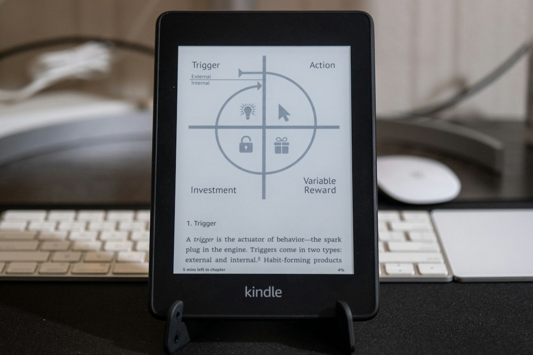
The magic of the Kindle lies not just in its portability or vast library, but in the nuanced way it presents text to the reader. Far from the flickering, backlit screens of traditional tablets and computers, the Kindle employs a sophisticated display technology designed to mimic the experience of reading on paper. This dedication to clarity, combined with a suite of adjustable features, ensures that every word is rendered in a way that is both comfortable and engaging for the discerning reader. The underlying principles of how Kindle displays text are a testament to thoughtful design, prioritizing the user’s visual experience above all else.
The E-Ink Canvas: A Foundation of Clarity
At the heart of the Kindle’s superior text display is its use of E-Ink technology. Unlike the emissive screens found on most electronic devices, which generate light, E-Ink screens are reflective. This fundamental difference has profound implications for readability, particularly in bright ambient light.
How E-Ink Mimics Paper
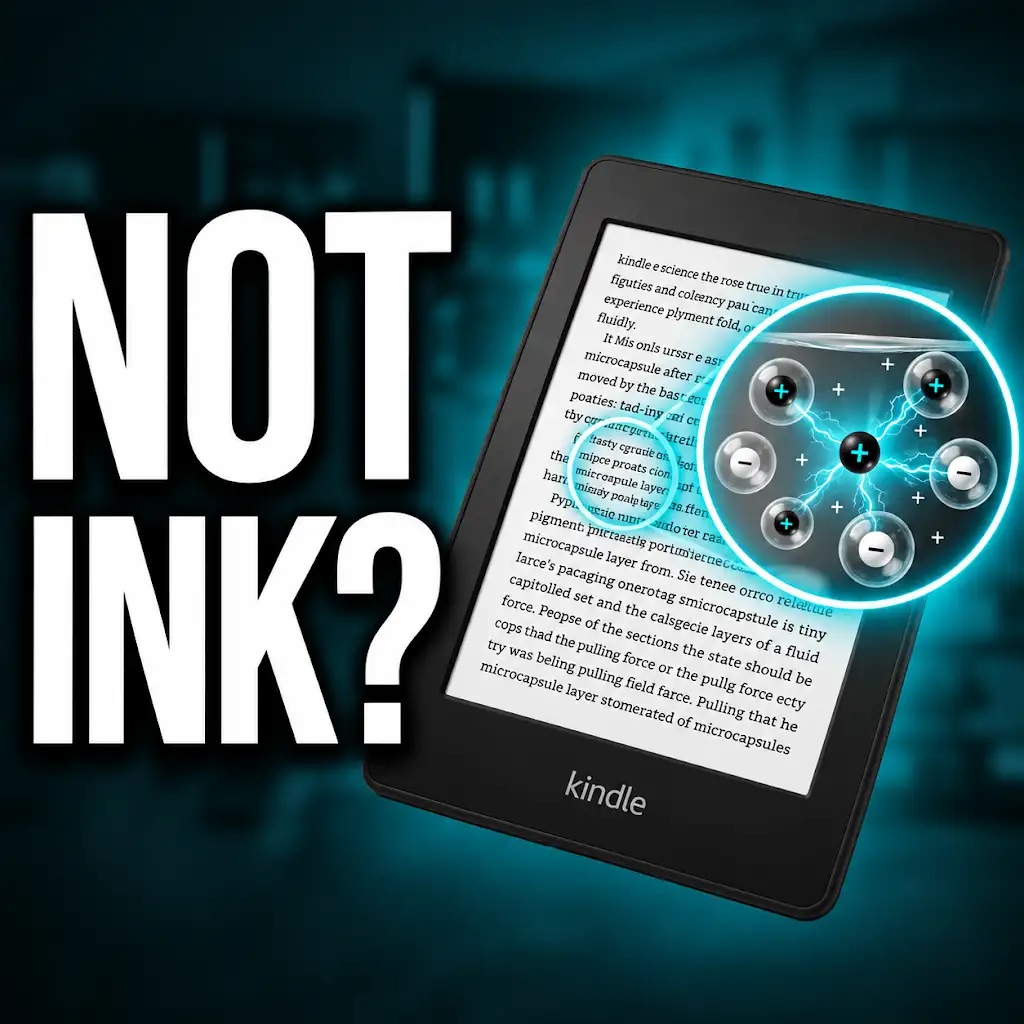
E-Ink, or electronic ink, is a proprietary technology that uses microcapsules containing charged white and black particles suspended in a clear fluid. When an electrical charge is applied, these particles move to the surface of the microcapsule, forming the text and images that the reader sees. The result is a display that has a matte finish, much like paper, and requires external light to be visible. This reflective nature means that the Kindle screen does not emit its own light, eliminating the harsh glare often associated with backlit displays. Consequently, the strain on the eyes is significantly reduced, allowing for longer, more comfortable reading sessions. The contrast between the “ink” and the “paper” is exceptionally high, creating crisp, sharp edges for text that is easy to focus on.
Advantages Over Backlit Screens
The benefits of E-Ink over backlit screens are numerous for a reading device. Firstly, the absence of backlight drastically reduces eye fatigue. Backlit screens, by their very nature, emit light directly into the eyes, which can lead to dryness, irritation, and headaches, especially during extended use. E-Ink’s reflective quality, on the other hand, allows the screen to be read in direct sunlight, much like a physical book. In fact, the brighter the ambient light, the clearer the E-Ink display becomes. This makes the Kindle an ideal companion for outdoor reading, beach trips, or simply reading by a sunny window. Furthermore, E-Ink displays consume significantly less power than backlit screens. The screen only requires power when the image is being updated, meaning that a single charge can last for weeks, a stark contrast to the daily or near-daily charging required by most tablets and smartphones. This energy efficiency further enhances the user’s uninterrupted reading experience.
The Evolution of E-Ink Technology
Amazon has continuously refined its E-Ink technology over the generations of Kindle devices. Early E-Ink screens had a slower refresh rate, resulting in noticeable “ghosting” or faint remnants of previous images. However, modern E-Ink displays, particularly those found in the latest Kindle Paperwhite and Kindle Oasis models, have dramatically improved refresh rates. This has led to a much smoother reading experience, with faster page turns and a more seamless transition between text and images. The resolution has also seen significant enhancements, moving from lower DPI (dots per inch) counts to crisper, higher-resolution displays that can render even the smallest print with exceptional clarity. Color E-Ink technology is also emerging, though it is not yet standard on most Kindle devices, and its application is primarily for enhanced graphic novel and comic book experiences. For standard text-based books, the monochrome E-Ink remains the gold standard for optimal readability.
The Kindle’s unique display technology significantly enhances the reading experience by mimicking the appearance of printed paper, which reduces eye strain and improves readability. For a deeper understanding of how Kindle displays text and the science behind its e-ink technology, you can explore this related article: here.
Font Selection: The Personalization of Print

Beyond the underlying display technology, the Kindle offers a remarkable degree of control over the typographic elements of a book. This allows readers to tailor the font choice, size, and style to their individual preferences, transforming the reading experience into a truly personalized one.
Amazon’s Curated Font Library
Amazon understands that font selection is subjective and deeply personal. To cater to a wide range of tastes and reading needs, the Kindle devices come pre-loaded with a curated selection of fonts. These fonts are chosen for their legibility, aesthetic appeal, and suitability for the E-Ink display. The library typically includes classic serif fonts like Times New Roman, which offer a traditional feel with clear ascenders and descenders, aiding in word recognition. It also features popular sans-serif fonts such as Arial and Helvetica, known for their clean, modern appearance and excellent readability, especially at smaller sizes. For readers seeking a more distinctive typographic experience, fonts like Bookerly, Amazon’s own designed font optimized for Kindle, and Caecilia, a robust slab-serif, are often included. Bookerly, in particular, aims to combine the best qualities of modern and classic typefaces for an effortlessly comfortable reading experience. The selection is designed to cover various styles, from the formal and academic to the casual and contemporary.
The Impact of Font Choice on Readability
The font chosen for an e-book can significantly impact how easily and enjoyably it is read. Different fonts have varying stroke widths, x-heights (the height of lowercase letters without ascenders or descenders), and kerning (the spacing between specific letter pairs). These factors influence how the eye perceives and processes words. For instance, a font with a larger x-height generally appears more readable at smaller sizes because the core of the letter is more prominent. Serifs, the small decorative strokes at the ends of letters, can help guide the eye along the line of text, aiding in faster reading for some individuals. Conversely, sans-serif fonts often convey a sense of simplicity and directness, which can be less visually demanding for others. The purpose of the Kindle’s font library is to provide readers with options that excel in these areas, ensuring that no matter the preference, a font exists that maximizes clarity and minimizes reader fatigue. Experimenting with different fonts can reveal a surprising difference in reading comfort and speed.
User-Defined Font Customization
The Kindle’s customization options extend beyond simply choosing a font from a list. Once a font is selected, readers have granular control over its appearance. The most common and impactful adjustment is font size. Users can easily increase or decrease the size of the text, ensuring that it is perfectly legible for their vision and reading environment. This is particularly beneficial for individuals with visual impairments who may require larger text than what is typically found in print books. Beyond size, Kindle devices also allow for adjustments to boldness, line spacing, and margins. Increasing line spacing can improve readability by creating more visual separation between lines of text, preventing the eye from skipping ahead or falling behind. Adjusting margins can provide more “white space” around the text, which some readers find less overwhelming and more aesthetically pleasing. These subtle yet powerful adjustments empower the reader to create a reading environment that is uniquely theirs, optimizing the visual flow of words on the E-Ink screen.
Adjustable Text Settings: Fine-Tuning the Reading Experience

The Kindle’s commitment to reader-friendliness is further demonstrated by its extensive range of adjustable text settings. These features allow users to fine-tune the presentation of text to suit their individual needs and preferences, transforming the act of reading into a more comfortable and efficient process.
Font Size and Weight: The Building Blocks of Legibility
The most fundamental and impactful adjustment a Kindle user can make is to the font size. This feature is crucial for accessibility, catering to a spectrum of visual acuities. Whether a reader prefers a more condensed text block or large, easily discernible characters, the Kindle offers a smooth slider or incremental buttons to achieve the desired size. Moving beyond mere size, the option to adjust font weight, or boldness, also plays a significant role in legibility. Some users find a slightly bolder font easier to read, especially in lower light conditions or when dealing with less-than-ideal contrast. The Kindle typically allows users to select from a range of weights, from the standard to a more pronounced boldness, ensuring that the text stands out effectively against the E-Ink background. This combination of size and weight control provides the foundational tools for ensuring that the text is not only visible but also comfortable to process.
Line Spacing and Margins: Creating Visual Harmony
The space between lines of text, known as line spacing or leading, and the space surrounding the text block, the margins, are often overlooked elements that significantly influence reading fluency. The Kindle recognizes the importance of these visual cues and offers adjustments for both. Increasing line spacing can prevent words from running into each other and provides a more comfortable visual rhythm for the reader. This is particularly helpful for individuals who may struggle with tracking lines of text. Conversely, some readers might prefer slightly tighter line spacing for a more compact text presentation. Similarly, the ability to adjust margins allows users to control the amount of “white space” around the text. Generous margins can make the text feel less dense and more inviting, while tighter margins can maximize the amount of text visible on the screen at once. This fine-tuning of spacing and margins allows readers to optimize the visual composition of the page, contributing to a more pleasant and less visually fatiguing experience.
Alignment Options: From Left to Justified
The way text is aligned on a page can dramatically alter its appearance and readability. The Kindle typically offers several alignment options, most commonly left-aligned, justified, and sometimes centered. Left-aligned text is the simplest and often the most natural for readers accustomed to Western languages, as it creates a consistent starting point for each line and avoids large gaps between words. Justified text, which is common in printed books and newspapers, aligns text to both the left and right margins, creating a clean, rectangular block of text. While visually appealing to some, justification can sometimes lead to awkward spacing between words, particularly in narrower columns, which can disrupt reading flow for certain individuals. The Kindle’s inclusion of these different alignment choices, along with the ability to switch between them, allows readers to select the style that best suits their reading habits and preferences, further personalizing the on-screen reading experience.
Advanced Typographic Controls: For the Discerning Reader
For those who appreciate the finer details of typography, the Kindle offers a selection of advanced controls that allow for even greater personalization. These settings, while perhaps less frequently used by the casual reader, empower a more discerning user to craft an ideal typographic environment.
Letter Spacing and Word Spacing: Subtle Adjustments for Flow
While line spacing and margins address larger compositional elements, the Kindle also allows for more subtle adjustments to letter and word spacing. These features are particularly useful for readers who may have specific visual processing needs or simply a preference for a particular feel to the text. Fine-tuning letter spacing, often referred to as kerning, can improve the legibility of certain letter combinations that might otherwise appear too close together or too far apart. Similarly, adjusting word spacing can help to create a more uniform and aesthetically pleasing distribution of text across the line. For some readers, slightly wider word spacing can improve readability by clearly delineating individual words. For others, a more compact spacing might be preferred for a denser text presentation. These advanced controls, while seemingly minor, can contribute significantly to the overall comfort and flow of reading, allowing for a truly bespoke typographic experience.
Hyphenation and Pagination: Mimicking Print Conventions
The Kindle’s ability to control hyphenation and pagination further bridges the gap between digital and print reading. Hyphenation, the process of breaking words at the end of a line, is a common practice in print to maintain consistent word spacing and a cleaner page appearance. While E-Ink displays are highly adaptable, the option to enable or disable hyphenation allows readers to choose whether they prefer the visual consistency of justified text with hyphenated words or the simpler, uninterrupted flow of left-aligned text without hyphens. Pagination, the numbering and arrangement of pages, is also an important aspect of book design. Kindle devices typically display page numbers, but the method of estimation or synchronization with print page numbers can be adjusted. This allows readers to maintain a sense of their progress through the book, mirroring the experience of turning physical pages and providing a familiar navigational anchor.
Language-Specific Typographic Features
The Kindle’s typographic engine is also sensitive to the nuances of different languages. For languages with specific diacritical marks, ligatures, or unique character sets, the Kindle’s rendering engine ensures accurate and legible display. This means that characters like accents, umlauts, and cedillas are rendered correctly, and ligatures (combined characters like ‘æ’ or ‘œ’) are displayed as intended. Furthermore, for languages that read from right to left, such as Arabic or Hebrew, the Kindle’s display technology and text rendering capabilities are adapted to accommodate these distinct writing systems, ensuring a consistent and high-quality reading experience regardless of the language being consumed. This multilingual typographic support underscores the Kindle’s commitment to global accessibility and its dedication to providing a superior reading experience for all users, no matter their linguistic background.
The Kindle’s unique display technology significantly enhances the reading experience by mimicking the appearance of printed text, which can be quite beneficial for avid readers. For those interested in exploring how different e-readers utilize various display technologies, a related article can be found at Freaky Science, where you can learn about the advancements in e-ink technology and its impact on digital reading. This understanding can help readers appreciate the nuances of their devices while enjoying their favorite books.
Accessibility and Eye Comfort: A Core Design Principle
| Feature | Description | Details / Metrics |
|---|---|---|
| Screen Type | E Ink Carta | 300 ppi resolution, grayscale (16 levels) |
| Font Rendering | Anti-aliased, optimized for e-ink | Supports multiple fonts, adjustable size and boldness |
| Text Layout | Reflowable text | Adjustable margins, line spacing, justification |
| Refresh Rate | Page refresh | Full refresh ~1 second, partial refresh faster to reduce ghosting |
| Contrast | Adjustable front light | Brightness levels from 0 to 24 (varies by model) |
| Text Highlighting | Selectable text with highlights and notes | Supports multiple colors and export options |
| Orientation | Portrait and landscape modes | Automatic or manual rotation |
| Line Spacing Options | Adjustable line spacing | Options: Tight, Normal, Loose |
| Word Spacing | Adjustable | Helps improve readability |
| Page Turn Animation | Instant page refresh or fade | Option to disable animations for faster page turns |
The Kindle’s design philosophy is deeply rooted in accessibility and the prioritization of eye comfort. These principles are not mere afterthoughts but are woven into the very fabric of how the device displays text, ensuring that reading remains a pleasurable and healthy activity for everyone.
Reducing Digital Eye Strain
The primary advantage of the Kindle’s E-Ink display is its profound impact on reducing digital eye strain. Traditional backlit screens emit blue light, which can disrupt natural sleep patterns and contribute to eye fatigue. The reflective nature of E-Ink, as previously discussed, eliminates this blue light emission. Instead, the screen behaves like paper, reflecting ambient light. This means that the Kindle can be read for extended periods without the discomfort often associated with prolonged screen time on other devices. The absence of glare and the high contrast ratio further contribute to this comfort, making the text appear crisp and clear without requiring the eyes to constantly adjust to a self-illuminating source. This focus on minimizing strain is perhaps the most significant contribution of Kindle’s display technology to the reading experience.
Features for Visually Impaired Readers
Beyond the inherent readability of E-Ink, Amazon has incorporated several features specifically designed to assist readers with visual impairments. The ability to drastically increase font size is paramount, ensuring that even those with significant vision loss can comfortably read the text. The option to adjust font weight provides an additional layer of control for enhancing legibility. Furthermore, many Kindle models offer text-to-speech functionality, allowing users to listen to books if reading visually is challenging. For users who prefer to navigate their device via screen readers, the Kindle interface is designed to be compatible, providing auditory feedback for menu navigation and text elements. These inclusive features demonstrate a commitment to making literature accessible to as broad an audience as possible, ensuring that the joy of reading is not limited by visual challenges.
Read-Aloud Capabilities and Contrast Adjustment
The read-aloud feature, powered by Amazon’s Text-to-Speech (TTS) technology, transforms the Kindle into an audiobook player. This is an invaluable tool for individuals who may have difficulty reading for extended periods or who simply prefer to listen to their books. The TTS engine can read any compatible e-book aloud, with the option to adjust the narration speed and voice. While not a replacement for professional audiobook narration, it offers a convenient and accessible way to consume content. Additionally, some Kindle devices offer contrast adjustment settings. While E-Ink inherently provides high contrast, the ability to slightly modify the contrast levels can be beneficial for users who find certain levels more comfortable for their specific visual needs or in different lighting conditions. These adjustments, combined with the core E-Ink technology, create a reading environment that is both adaptable and forgiving.
The Future of Kindle Text Display: Innovations on the Horizon
The evolution of Kindle’s text display technology is an ongoing journey, with Amazon continually investing in research and development to push the boundaries of what’s possible. The focus remains on enhancing clarity, comfort, and the overall reading experience.
Higher Resolution and Faster Refresh Rates
The pursuit of an even more paper-like experience drives ongoing improvements in E-Ink resolution and refresh rates. Higher DPI (dots per inch) counts translate to sharper text and more detailed images, making even the smallest print appear crisp and free from pixelation. Similarly, faster refresh rates are crucial for a seamless transition between pages and for the smooth rendering of interactive elements or even subtle animations that might be introduced in future e-reading platforms. As E-Ink technology matures, readers can anticipate even more refined displays that further blur the line between physical and digital books.
Color E-Ink and Enhanced Graphics
While the current generation of Kindle devices primarily focuses on monochrome text for optimal reading of novels, the development of color E-Ink technology holds significant promise. Color E-Ink could revolutionize the reading experience for graphic novels, comics, magazines, and illustrated books, bringing vibrant visuals to the paper-like display. The challenge lies in achieving rich, saturated colors while maintaining the low power consumption and readability benefits of E-Ink. As this technology becomes more viable and cost-effective, it’s highly probable that future Kindle devices will incorporate color displays, expanding the range of content that can be enjoyed on the platform with unparalleled visual fidelity and eye comfort.
AI-Powered Text Optimization
Looking further ahead, artificial intelligence (AI) could play a role in personalizing text display even more profoundly. Imagine AI analyzing a reader’s habits, eye movements (with user consent, of course), and even ambient lighting conditions to dynamically adjust font size, weight, line spacing, and contrast in real-time. AI could also be used to intelligently select the most appropriate font for a particular genre or authorial style, or even to identify and correct subtle typographic inconsistencies within an e-book. This level of intelligent optimization would take the Kindle’s reader-friendliness to an unprecedented level, ensuring that every reading session is as comfortable, clear, and engaging as possible. The future of Kindle text display is not just about better hardware; it’s about smarter software working in harmony with cutting-edge display technology.
Why Your Kindle Screen Doesn’t Work the Way You Think
FAQs
How does a Kindle display text?
A Kindle uses electronic ink technology to display text on its screen. This technology mimics the appearance of ink on paper, providing a reading experience that is easy on the eyes.
Can I adjust the text size on a Kindle?
Yes, you can adjust the text size on a Kindle to suit your preferences. This feature allows you to make the text larger or smaller for comfortable reading.
Does a Kindle support different fonts for displaying text?
Kindle devices typically offer a selection of fonts that users can choose from to display text. While the options may vary, there are usually several font choices available.
Is it possible to change the background color of text on a Kindle?
Some Kindle models allow users to customize the background color of the text. This feature can help improve readability, especially in different lighting conditions.
Can I highlight and make notes on text displayed on a Kindle?
Yes, you can highlight passages and make notes on text displayed on a Kindle. This feature is useful for marking important sections or jotting down thoughts while reading.