You’ve likely encountered it in art class, a circle divided into segments, a vibrant arrangement of hues. The color wheel. It’s presented as the foundational tool for understanding color, a seemingly complete map of the visible world of light. But here’s a secret: the color wheel you know and love is a simplification, a carefully curated selection that, in its elegance, leaves out a vast universe of color nuances and variations that exist in reality. You might be surprised to learn just how much the standard color wheel omits, and why this simplification is both its strength and its significant limitation.
The color wheel, in its most common iteration, is a diagram representing relationships between colors. It typically features primary colors (red, yellow, blue in the subtractive RYB model, or red, green, blue in the additive RGB model), secondary colors (created by mixing primaries), and tertiary colors (created by mixing a primary and a secondary). This arrangement creates a visual hierarchy, demonstrating how colors can be combined to create new ones and how they interact with each other. You learn about complementary colors, analogous colors, and triadic color schemes, all derived from this organized circular format. It’s a beautifully intuitive system, designed for ease of understanding and practical application in art and design.
The Subtractive RYB Model: A Traditionalist’s View
When you first encountered the color wheel, it was probably the RYB (Red, Yellow, Blue) model. This is the traditional model used by artists for mixing pigments. You learn that mixing red and yellow creates orange, yellow and blue create green, and blue and red create violet. This is a powerful concept, allowing you to predict and create a range of secondary colors. It’s the foundation of countless paintings and designs.
The “Pure” Primaries: An Artistic Ideal, Not a Physical Reality
What the RYB model doesn’t fully convey is the reality of pigment. The “pure” reds, yellows, and blues you see on a theoretical wheel don’t perfectly exist as single pigments. Every red pigment, for instance, has a subtle undertone. Is it a warm, orangey red, or a cool, purplish red? This undertone dramatically affects how it mixes with other colors. You discover that mixing a cadmium red with a cerulean blue yields a different violet than mixing an alizarin crimson with a phthalocyanine blue. The wheel, in its simplicity, glosses over these inherent characteristics of real-world materials.
The Additive RGB Model: For the Digital Realm
Then there’s the RGB (Red, Green, Blue) model, prevalent in digital displays. Here, you’re dealing with light. Mixing red and green light produces yellow, green and blue produce cyan, and blue and red produce magenta. When all three are combined at full intensity, you get white light. This is how your computer screen and television work.
The Wavelength Symphony: Light’s True Nature
However, even the RGB model, while more scientifically accurate for light, still simplifies. Visible light, that continuous spectrum you perceive, is far more complex than just three primary colors. While red, green, and blue are crucial for triggering the color receptors in your eyes, they don’t represent the entire range of wavelengths that make up light. You might wonder why a certain shade of turquoise appears on your screen; it’s not a direct combination of just green and blue light, but a specific frequency of light that your brain interprets as such. The color wheel presents a curated selection, not the full, glorious symphony of electromagnetic radiation.
The color wheel is often mistaken for the visible spectrum, but it represents a more simplified version of how colors relate to one another rather than the full range of wavelengths that humans can perceive. For a deeper understanding of this distinction, you can explore the article at Freaky Science, which discusses the differences between the color wheel and the visible spectrum, shedding light on the complexities of color perception and the science behind it.
Beyond the Basic Six (or Twelve): The Untamed Wilderness of Color
The standard color wheel, whether RYB or RGB, usually stops at 12 hues. This is a manageable number, making it easy to grasp relationships. But step outside this structured circle, and you enter a vast, untamed wilderness of color variations. These are the subtle shifts, the in-between shades that the color wheel, by its very nature, excludes.
The Infinite Gradient: Where Colors Blur and Blend
Think about the sky at sunset. It’s not just a simple transition from orange to red. You see delicate peaches, fiery scarlets, deep indigos, and soft lavenders, all seamlessly blending. This is a continuous gradient, a spectrum where colors don’t have distinct boundaries but rather flow into one another. The color wheel, with its segmented slices, offers discrete points rather than the smooth, flowing transitions that are so prevalent in nature.
Hue Variations: The Subtle Shifts in “Redness”
Consider the color red. On a color wheel, it’s simply “red.” But in reality, you have a spectrum of reds: vermillion, scarlet, crimson, ruby, rose, coral, and countless others. Each of these has a slightly different hue, a subtle shift in its position along the visible spectrum. This variation is crucial for artists and designers who need to evoke specific moods or replicate specific objects. The color wheel offers a broad stroke, not the finely detailed brushwork of reality.
Saturation and Value: The Missing Dimensions
Perhaps the most significant omissions from the standard color wheel are the dimensions of saturation and value. The color wheel primarily focuses on hue, the pure color itself. It doesn’t fully represent how colors change when you add gray (desaturation) or white/black (value).
The Power of Muted Tones: Desaturation’s Impact
You might have a vibrant, pure blue on the color wheel. But what about a dusty, muted blue, the color of worn denim? Or a sophisticated slate gray? These colors are achieved by reducing the intensity, or saturation, of the pure hue. While color wheels might show tints (adding white) and shades (adding black), they rarely delve into the infinite possibilities of desaturation, the process of adding gray. This is where a vast array of sophisticated and nuanced colors reside, colors that the basic wheel simply doesn’t illustrate.
The Dance of Light and Shadow: Value’s Role
Value, or lightness and darkness, is another crucial aspect of color that the color wheel doesn’t fully capture. While you might see a light and dark version of a hue, the true range of values is far more expansive. Think of how light falls on a red apple. You don’t just see red; you see highlights of pink, deep shadows of burgundy, and every variation in between. This interplay of light and shadow, of value shifts, is essential for creating form and depth, and the color wheel, in its flat, circular representation, struggles to convey this three-dimensional aspect of color.
The Spectrum of Light: A Continuous Flow, Not Discrete Segments
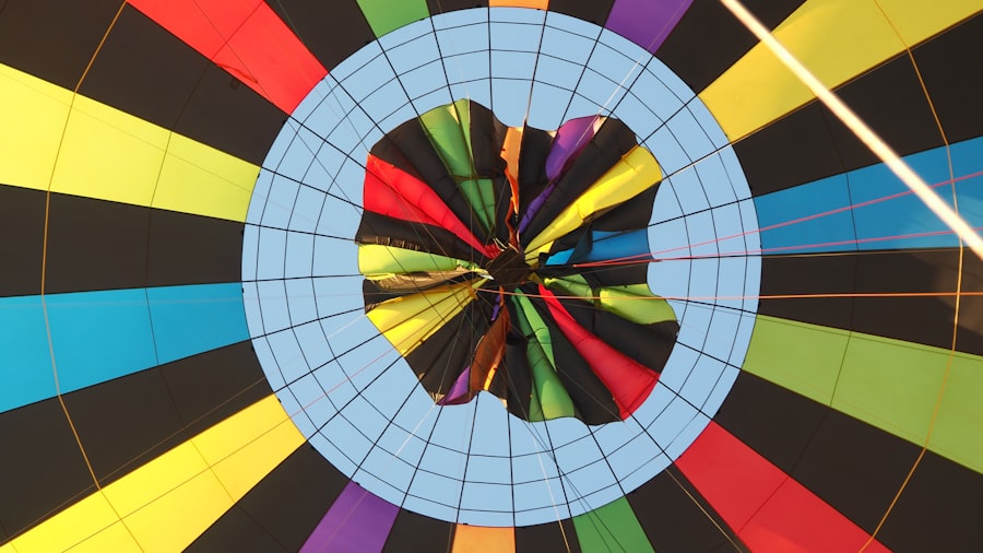
The very foundation of color, the visible electromagnetic spectrum, is a continuous flow of wavelengths. The colors we perceive are simply the result of our eyes and brains interpreting these different wavelengths. The color wheel, by segmenting this spectrum into distinct hues, creates an artificial division.
The Rainbow’s Deception: A Visual Analogy
Think of a rainbow. You see distinct bands of color: red, orange, yellow, green, blue, indigo, violet. But even in a rainbow, the boundaries between these colors are not sharp lines. They bleed into one another, forming a continuous gradient. The color wheel takes this smooth transition and chops it up into bite-sized pieces.
Beyond Violet: The Invisible Edges of Perception
The color wheel typically ends with violet. But what about the colors just beyond violet, in the ultraviolet range, or just before red, in the infrared range? While humans cannot perceive these wavelengths directly, their influence on the visible spectrum and their interactions with materials are significant. The color wheel, focused solely on what our eyes can see, ignores these invisible edges that nonetheless contribute to the overall visual experience.
The Complexities of Pigment Interaction: Beyond Simple Mixing
When you mix pigments, you’re not just blending pure colors. You’re dealing with light absorption and reflection. Each pigment molecule absorbs certain wavelengths of light and reflects others. When you mix pigments, you’re altering the overall absorption and reflection properties of the mixture, leading to complex interactions that can’t always be predicted by simple color wheel logic.
Accidental Discoveries: The Art of the Unexpected
Many beautiful colors are discovered through experimentation, through accidental mixes that produce shades not explicitly represented on the wheel. You might be trying to create a specific green, but end up with a fascinating, mossy hue that’s more nuanced than any standard green on your wheel. These are the moments where you move beyond the theoretical and into the tangible, where the limitations of the color wheel become apparent.
Why the Simplification Persists: The Power of a Functional Tool

Despite its inherent limitations, the color wheel remains an indispensable tool. Its strength lies in its ability to simplify complexity, making color theory accessible and actionable.
The Artist’s Compass: Guiding Creative Choices
For artists, the color wheel serves as a compass. It provides a framework for understanding color harmony, for making deliberate choices about which colors to use together to evoke a particular mood or create a specific visual impact. You learn about complementary colors for strong contrast, analogous colors for harmonious blends, and triadic schemes for balanced compositions. These are practical applications that allow you to translate your artistic vision into reality.
Practicality Over Precision: Art’s Pragmatic Approach
Art and design are often about practicality. While a deep understanding of every nuance of the visible spectrum is fascinating, a simplified model that allows for efficient creative decision-making is often more valuable in the studio or on the design table. The color wheel offers this practicality, a shortcut to understanding basic color relationships.
The Foundation of Education: Teaching the Fundamentals
The color wheel is a crucial pedagogical tool. It provides a clear and concise way to introduce the fundamental concepts of color to students. You learn about the primary, secondary, and tertiary colors, and the basic principles of color mixing and harmony. Without this simplified foundation, grasping the more complex aspects of color theory would be significantly more challenging.
Building Blocks for Advanced Concepts: From Simple to Complex
The color wheel serves as the building blocks for more advanced color theory. Once you understand the basic relationships presented on the wheel, you can then begin to explore the nuances of saturation, value, and the psychological impact of different hues. It’s a stepping stone, a necessary starting point before you can venture into more intricate explorations.
The color wheel is often misunderstood as a direct representation of the visible spectrum, but it actually serves a different purpose in color theory. For a deeper understanding of this distinction, you can explore an insightful article on the topic at Freaky Science. This resource explains how the color wheel organizes colors based on their relationships rather than their physical properties, highlighting the importance of context in color perception.
Embracing the Nuance: Moving Beyond the Wheel’s Boundaries
| Reason | Explanation |
|---|---|
| Wavelength Range | The visible spectrum covers a range of wavelengths from approximately 380 to 700 nanometers, while the color wheel includes colors beyond this range. |
| Perception of Color | The color wheel is based on the perception of color by the human eye, which can differ from the actual wavelengths of light in the visible spectrum. |
| Artistic Representation | The color wheel is often used as a tool for artists and designers to understand color relationships, but it does not accurately represent the full range of visible light. |
While the color wheel is a valuable starting point, it’s crucial to understand its limitations and to venture beyond its neatly defined boundaries to truly appreciate the vastness and complexity of color.
Developing Your Eye: The Art of Observation
The best way to overcome the color wheel’s limitations is to cultivate your powers of observation. Train your eye to see the subtle shifts in hue, saturation, and value in the world around you. Look at how light interacts with surfaces, how colors change under different lighting conditions, and how adjacent colors influence each other. This is where you begin to perceive the full spectrum of color.
Color Palettes in Nature: A Masterclass in Nuance
Nature is the ultimate color theorist. Observe the intricate color palettes of a butterfly’s wing, the subtle variations in a ripening fruit, or the complex interplay of colors in a forest floor. These are not simple representations of the color wheel; they are masterful compositions of nuanced hues, saturations, and values that inspire and educate.
The Role of Technology: Expanding Our Color Perception
Modern technology plays a significant role in helping us understand and reproduce a wider range of colors. Digital color tools, colorimeters, and advanced printing technologies allow us to capture, manipulate, and display colors with a precision that was once unimaginable. These tools can help you visualize and understand colors that fall outside the traditional color wheel.
Digital Tools: Exploring Beyond the 12 Hues
Software like Adobe Photoshop and Illustrator offers a much more nuanced approach to color selection. You can precisely control hue, saturation, and value, and explore an extensive range of color spaces that go far beyond the basic color wheel. This allows you to experiment with combinations and create palettes that are rich in subtle variations.
The Intuitive Artist: Trusting Your Creative Instinct
Ultimately, the most skilled artists and designers often develop an intuitive understanding of color that transcends rigid theoretical frameworks. While the color wheel provides a starting point, it’s your creative instinct and your experience that will guide you to the most impactful color choices. You learn to trust your gut, to experiment, and to discover what works best for your individual vision. The color wheel is a guide, not a dictator. It’s a tool to be understood, appreciated for its utility, but ultimately surpassed in your journey to truly master the art and science of color. You are not limited by the circle; the world of color is far more expansive.

Why Your Brain Had to Invent Magenta
FAQs
What is the color wheel?
The color wheel is a circular chart that organizes colors in a way that shows their relationships to each other. It is often used by artists and designers to understand color theory and create harmonious color schemes.
What is the visible spectrum?
The visible spectrum is the range of colors that can be seen by the human eye, typically from red to violet. These colors are the result of different wavelengths of light that are visible to the human eye.
Why is the color wheel not the visible spectrum?
The color wheel is not the visible spectrum because it is a simplified representation of color relationships, while the visible spectrum represents the actual range of colors that can be seen by the human eye. The color wheel does not accurately depict the continuous spectrum of colors that make up the visible spectrum.
How does the color wheel differ from the visible spectrum?
The color wheel organizes colors into specific categories, such as primary, secondary, and tertiary colors, and shows their relationships in a circular format. The visible spectrum, on the other hand, represents the continuous range of colors that can be seen by the human eye, without categorization or organization.
What are the implications of the differences between the color wheel and the visible spectrum?
Understanding the differences between the color wheel and the visible spectrum is important for artists, designers, and anyone working with color. It helps to recognize that the color wheel is a tool for organizing and understanding color relationships, while the visible spectrum represents the actual range of colors that can be perceived by the human eye.